Welcome to my blog. In it you will find the blogged process by which i have researched various music magazines in order to complete my own front page,contents page and double page spread. I have blogged every step of the process including what I found to be my strengths and weaknesses. My blog is clear to understand with my front cover, contents page and doubble page spread all located towards the top of the page and the process leading up to their creation is in order underneath.
I have blogged about pictures I took with my camera and how they looked before and after editing. I also blogged the stages in the creation of my magazine and how it progressed.
Friday, 27 April 2012
Tuesday, 17 April 2012
Main Pictures In 'alternative' Magazine
 |
| This image was used on the front cover of my music magazine. This image is the original version as it was before it was edited. After it had been edited, the image looked clearer and brighter and made more bold for the consumer. |
 |
| This image was used on my contents page as a preview of what can be found on the double page spread. |
 |
| This was the main image used on my double page spread which was edited to bring out the various colours in the picture. This picture also depicts a guitar and displays the musical genre of the magazine. |
 |
| This is the last picture to be used in my music magazine and shows a different image of the same artist who is interviewed on the double page spread. The guitar highlights the fact that it is a musical magazine and along with the interview makes the reader clear of the fact that is is specifically a country magazine. |
Double page spread
 |
| To start my double page spread, I began to edit an image I had taken especially for the page and interview. Above the picture I have wrote the name of the artist 'Oli Bright' in bold, eye-catching writing and underneath this I have included a quotation. |
 |
| I then placed another edited picture on the right of the pageto give the reader an idea of the type of music the artist represents. At the bottom of the first image I began to write an introduction to the interview and to give an overview of what would be within. |
 |
| I then went on to write my interview which is set up in the way that is a continuous piece of speech from the artist. The interview has included in it various parts of information so that the fact that the magazine is of a 'country' genre comes across. The page is set up so that it is clear for the reader to read with the writing layed out in columns. |
Contents Page
 |
| Firstly when I began to construct my contents page I inserted various images I had taken previously, including one which is similar to those I will use on my double page spread. I have placed the particular four images at the top of the page because I felt that they gave a particular stance to back up my Country genre. |
 |
| I then used my house colour grey to write the word 'Contents' in a bold font underneath the pictures on the left hand side of the page. Underneath this I wrote the month and year of publication as well as the issue number. |
 |
| Written at the bottom right corner of the page is the name of the magazine, month and year of publication and the page number. Above this is an inducement I have included which entitles readers to a cheaper subscription to the magazine. I have used various page numbers and headings to show the range of articles within the magazine. There are headings which give structure to the articles and so that they are easy to find and understand. Various offers are included as well as stories and news of music charts of the country genre. |
Front Cover
 |
| When I started to create my music magazine I first began to work on my front cover. I used the pictures I had previously taken and edited and placed my cover image on the page. I placed the image on the mid and right third of the page. I have edited the image so that the picture is brighter and stands out more than the original version. |
 |
| Secondly I began to review the types of font and font size I would like to use for the title of my front cover. I chose the colour red to make the title bold to make it stand out and to contrast my chosen picture. I then used my house theme colour grey for the month of publication and price of the magazine, this text is situated under the title. At this stage I also placed the barcode of my magazine in the bottom of the left-third of the front cover. |
 |
| During the third stage of creating my front cover I placed a selling line at the top of the title. The colour of the font is written in black and uses bold fonts. |
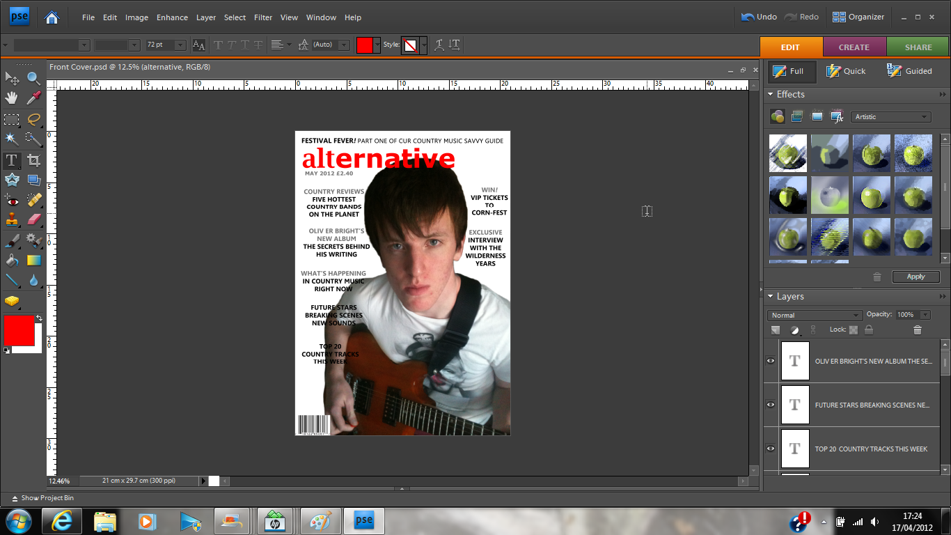 |
| I then continued to place cover lines mainly on the left-third of the page and two selling lines on the right-third. Having a range of stories gives the impression that it is a well informed and reputable magazine. I have gone with my theme of a country music magazine and I believe this to come through on my front cover. |
Sunday, 15 April 2012
Finalised Music Magazine Pitch
After revising my music magazine pitch, I have decided to set my magazine's genre as a modernised country magazine. At first I had wanted to cover a range of music genres, however I felt that condensing my choices down to one type of music would work to my advantage. Instead of my magazine being stereotypical of older 'Country' magazines, I am going to take on a modern view and include in my front cover, aspects which would appeal to a younger audience. My music magazine will be called 'alternative' which represents an alternative type of music.
The target audience for my magazine is one which embraces the modern cultures of the world but at the same time enjoys different styles of music. The magazine will be aimed at an audience who are looking to read about country music which is not the norm perhaps and are looking for a quality music magazine which covers all of their interests. My music magazine will have a house theme of white, red and grey. The front page will have anoverall white background. The title of the magazine will be situated at the top of the page, written in bold, eye catching, red text amd there will be a full page image of the country singer from the interview.
The contents page will use the same house theme and be bold and eye catching. My contents page will have pictures at the top of the page and contain page numbers of various articles underneath which would be inside the magazine.
Research and analysis of magazine double page spreads

A full page image has been placed on the left hand page and the image is clear and direct. Straight away it can be assumed that the article featured is about a band. The right hand page is given to a feature article on the band. The article is not written in a question and answer format however it is written with answers given by the band itself. To the right of the article, there is a feature on other bands which would probably follow in the same music patterns of the band which is being interviewed.
The colour blue has been used throughout the article with a white background on the right hand side. The colour black comes through quite strong because of a large amount of black text and a box on the right hand page. The full page image, although not dark, goes along with the theme as well as the artists wearing dark clothing.
Friday, 30 March 2012
Research and analysis of magazine contents pages

This is the contents page of Billboard music magazine, from this it is clear that the magazine does in fact cater for a wider audience other thn just country music. From my analysis of a 'Billboard' front cover, it had given the immediate impression that the magazine catered only for the country genre.
The magazine uses images images to illustrate what will be given to the reader inside of the magazine. They are positioned at the top of the contents page with page numbers included, they are clearly important to the features within the magazine as only four images are included. There is one large image which covers the width of the page and takes up approximately a third of the page. It is likely that this is representative of a main story within the magazine and the front cover of this issue probably featured the two people in this particular photograph.
From my original analysis of 'Billboard' magazine, it is much clearer that the magazine does in fact cater for a much wider audience than I had originally expected. The magazine seems modern and has a house theme of a white background, some blue headings of main stories and black writing. The blue of some of the writing does in fact link in with the blue in one of the letters in the title of the magazine.
Information is clearly structured with regular features at the bottom of the page and other articles included at the top. In the let-third of the page there is a featured section of albums, singles and other music which was at the top of the music charts at the time the magazine went to press. The music chart is the only franchise promoted on the actual page.This further displays the magazines feel for music and is clearly a regular feature which may also help the magazine to attract and widen their audience. There does not seem to be any type of promotional features on the contents page although there is a small 'billboard' logo in the left corner.

This is the contents page for Clash magazine, a bi-monthly magazine intended for an audience of 18-26 year olds who enjoy live alternative music from a range of genres. To a sophiticated, mature but still young audience, this contents page is eye-catching and bold, bright colours and pictures attract them to the magazine and because there is such a variety of styles from rock, dance, hip-hop and many more, the target audience is huge.
Lots of articles are featured on the double contents page spread with various inducements to attract the same levels of readership, such as the offer of free music downloads. This is a complete contrast to 'Billboard' magazine which offers no type of promotional feature to attract a larger audience. The audience is surely younger for the 'Clash' magazine and although aimed at people who live in the city, this is what they enjoy.
This magazine differs from Billboard's front cover because it offers free downloads to attract more readers and it is layed out in a much more reader-friendly way. This contents page, to me, seems much more appealing and this is what draws in a high readership to the magazine. There a lots of pictures to give a sense of the type of articles within the magazine and is very bright. There is a website in the bottom right of the page and the logo of the magazine in the bottom left corner of the page.
Wednesday, 28 March 2012
Research and analysis of magazine front covers
Billboard is a country music magazine which is easily recognisable with its bold heading to its target audience. It is clear that this music magazine has a set country genre with a large full-page image of a country singer, typically dressed to suit the theme of the magazie. It would be expected that articles in the magazine would follow what the audience can see from the front cover and there would be an article involving the singer on the front cover.
It could be percieved that the target audience for the magazine will be of the 30+ age group as it is not as bright and appealing as many younger people/teenageers would expect a magazine to be be bold and eye catching. Country music is typically an older persons music and doesn't usually appeal to a younger audience.
The cover image uses a whole page and this gives the impression that the article related to the person on the front cover will be onf relevance and importance. The way the person on the cover is dressed is typical of the way country singers are expected to dress, they fall into a stereotype. The the left of the image there is a main cover line, it is in bold and stands out to the reader. It is clearly an important article within the magazine. There are three other cover lines on the front cover of this issue of the magazine and they are much smaller than the cover line.
The magazine shows the country genre and even the title is able to give it a Country feel. The title also gives the impression that the magazine is aimed at an older audience in general as well as the overall design of the front cover. There is also no slogan to the magazine and this could suggest that it has a regular readership with the same people buying the magazine. Editors of the magazine do not need to attract a new audience who appreciate other styles of music, although they may try to widen their existing audience along with including different types of music on their other front covers in order to do this.
Colours used on the front cover of this magazine seem to be quite neutral and this gives the impression that the magazine aims to be more about the music of the artist rather than colour and appearance of the front cover. Colour is shown in a couple of cover lines and also letters in the title, however the rest of the text is simply white. Text used on the cover are not large except for that of the title and also the heading of the main cover line.
In contrast to 'Billboard' country magazine, the 'Rollingstone' magazine caters for an audience with an interest for rock but also looks at other aspects and types of music along those lines. From the front cover it is clear that articles inside will be eye catching and bold to catch the readers eye. Readers who may not usually buy the magazine may be drawn to buy particualr issues due to what they can see on the front cover.
This particular magazine is likely to have a much wider audience than that of 'Billboard' magazine becuase of the different types of music it represents and as a result it is able to cater for a wider audience, although 'Billboard' does cater for other audiences as well as the country genre. 'Rollingstone' magazine is well known across the world becuase of its popular music genre, however 'Billboard' magazine has much less coverage as it only appeals in theory to one audience and therefore its range can be very limited.
This front cover also has a full page image although in this case, it has a white background. The bold, red title so well known is able to be set behind the image and yet people would still recognise it on a shelf full of other magazines. There is clearly a house theme of white, black and red and even the main image complies with this. Along the top of the cover are the names of various well known bands who are featured within the magazine and all of the text is bold, easy to read from a distance. There is a distinctive main coverline although all of the writing featured is in bold writing.
The overall design of the front cover gives a completely different sense of the readership of this magazine than that of 'billboard', it seems much more fast paced and aiming to keep its readership up by providing eye-catching stories that instantly draw people in. The overall impression given from the magazine is that they know people will want to read their latest stories given that the magazine is highly credible and has been for many years. Country magzines are much less popular and it is for this reason that many people, especially those of younger generations would be unable to recognise magazines, such as 'Billboard', as easily as they would 'Rollingstone' for example.
Friday, 24 February 2012
Music Magazine Pitch
Genre
Music magazine in which there will be a range of different music styles so that the magazine is not necessarily directed to a specific audience.
Weekly/ Monthly price
I would price a monthly music magazine at around £3.75. There are likely to be many more special stories and offers than a weekly magazine and this would therefore make the monthly magazine more expensive to produce.
Audience profile
If a magazine covers a range of music styles and genres, it would broaden the readership, for instance a certain type of music is likely to determine the age of a reader. If many music styles are represented, the magazine will be read by a much wider range of people, e.g. age of person, style of music they may like etc.
Name (associations)
A music magazine title needs to be short, recognisable and bold so that on a shelf of magazines competing with eachother, a particular one will stand out to potential buyers. The title of a magazine is usually positioned at the top of the magazine front cover, starting in the left-third. The colour can be interchangeable so that it matches the main cover image for example.
House style, font, colours
A house style will run through the whole music magazine, much like different colours and fonts. The colours on the front cover will mostly be a match to colours used in the double page spread. These colours are likely to be colours associated with the musician who is being interviewed.
Images
A main image of the musician will dominate the background of the double page spread. At the bottom of the right page, images of the musician as they have progressed through their career to show their advances and how they have improved.
Double page spread (QA interview) (Artist/ Group profile)
The double page spread will consist of a question and answer interview with a specific musician. On the left hand page before the interview there will be an insight into the musicians music and at the bottom of the left hand page there may be a profile of the musician. Having a profile enables any reader who does not know so much about the musician to gather a good understanding of the style of them.
Wednesday, 22 February 2012
Preliminary task: School magazine front cover and contents page
 |
| School magazine: Front cover Whilst using photoshop to create my front cover, I was able to get more of an idea of how to use the programme. I was able to explore different aspects of photoshop and I was able to layer different photographs into the image and feather around the outside of them. I was also able to insert text, resize it, change the colour of the text and I was also able to change the background colour too. |
 |
| School magazine: Contents page When I started making my contents page I had become more confident with using photoshop and I was able to to change the format of the document to landscape. I inserted a line so that the centre of the page was visible as it is a double page contents page. I have inserted an image of students on the bottem left corner so that the magazine can be seen as appealing to students of all ages. I have used a range of page numbers of articles within the school magazine so that any readers can see how many pages are available to them within. Different sized fonts are able to highlight any main articles which may be in the magazine. |
First Photoshop: Nature magazine cover
 |
| This is my first photoshop attempt at maaking a mock-up magazine cover. It has been a practice for my preliminary task of creating a mock-up school magazine front cover and contents page before I create a music magazine front cover and contents page. I found using photoshop difficult today because it was my first real attempt at using it in a situation in which I had to make something come out of using it. |
Thursday, 16 February 2012
3rd February lessons
In this lesson we used the computers and photoshop to create a front cover of a nature magazine. I am not used to using photoshop and I find it quite a difficult programme to navigate and use. Due to having little knowlede of photoshop, my magazine cover started off simple, however, after using it in two media lessons on this day, I gradually grew more confident. I learnt how to crop a picture I had taken in a previous lesson of a bird, and place it on my document. I also learnt how to insert text, make it larger and change the colour. Overall I enjoy using Photoshop, although I will need more practice at it before I create my real magazine cover.
1st February lesson
Today learnt how to analyse contents pages of magazines. This included the analysis of the composition, images, graphics, text and themes within a contents page.
Composition
How the page is laid out and the effect it has on the reader.
How the text columns are laid out.
How the supporting images are laid out (within the columns, rotated, conventional).
Images
Main image (of what, why was it chosen?).
Supporting images- for which articles and why? What is the style? ( effects, black and white, etc.)
Graphics
Whether or not there are any supporting graphics (icons, logos, illustrations).
Text
Is there a headline?
How is the page defined as a contents page?
What styles of fonts are used? How many styles are used and do they change by section or feature?
Theme
What colours are usedand do they create a house style?
How does it relate to the front cover?
Analysis of a magazine cover: 29th January

27th January lesson: Photoshop
On Wednesday 27th January, we had a lesson on how to use Photoshop. We were instructed on how to use different aspects of the programme step by step, but I thought it was going to be easier than it actually was. The lesson was a good introduction to Photoshop, but I need more practice at it so I will know what I'm actually doing and be able to edit pictures properly.
18th January lesson.
Today I created my own blog, I have not done this before and it is my first time using the 'Blogger' website. The setting up of my blog went alright, after i had got used to how it needed to be done.
Subscribe to:
Comments (Atom)